A Short, Friendly History of Hebrew Letters — From Chisels to Keyboards
Hebrew letters didn’t just appear the way we know them today. They travelled—carved into stone, copied by scribes, cast in metal type, scanned into PostScript, and finally rendered by your phone. Here’s the whirlwind tour of how we got from ancient scratches to modern screens.
Before “Hebrew” looked Hebrew: Proto-Canaanite roots (2nd–1st millennium BCE)
Most scholars trace the alphabet used in the Levant to early Proto-Sinaitic/Proto-Canaanite signs—simple marks inspired by everyday objects (the classic example: aleph from an ox head). These signs evolved into the Phoenician alphabet (c. 1100 BCE), a streamlined, consonant-only script written right-to-left.
Why it matters: Hebrew, Aramaic, and many neighbors inherited this efficient idea: a small set of symbols to write many words.
Paleo-Hebrew: the first distinct “Hebrew” look (c. 10th–6th centuries BCE)
By the First-Temple period, the Israelites were writing a local variant now called Paleo-Hebrew—you’ll see it on artifacts like the Siloam Inscription and the Lachish Letters. The shapes feel angular and linear, very different from the “square” letters we use now.
Why it matters: This is the earliest recognizably Hebrew script; it proves a living writing culture long before printed books.

From exile to square: adopting Aramaic script (6th–4th centuries BCE)
After the Babylonian exile, Jewish communities operated in an empire where Imperial Aramaic was the administrative language and script. Over time, Jews adopted that script—what later tradition calls Ktav Ashuri (“Assyrian script”). This is the ancestor of today’s square Hebrew.
What changed: letter shapes rounded and regularized; five final forms (ך, ם, ן, ף, ץ) became standard at word endings; right-to-left remained.
The Masoretic revolution: vowels, music, precision (c. 7th–10th centuries CE)
For centuries, Hebrew was written as consonants only. Scholars known as the Masoretes (especially in Tiberias) added niqqud (vowel points) and cantillation marks to standardize pronunciation and chanting of the Bible.
Why it matters: They didn’t change the letters themselves—but they gave us the system to read scripture accurately across time and place.

Medieval scripts: regional “handwriting accents”
As Jewish communities spread, so did handwriting traditions:
-
Sephardi (Iberia/North Africa): rounder, flowing forms.
-
Ashkenazi (Central/Eastern Europe): more angular, compact strokes.
-
Rashi script: a semi-cursive print style (based on a Sephardi hand) used in printed commentaries—named for Rashi because his commentary was famously printed in it.
-
Soferut (STaM): the sacred, highly regulated hand for Sifrei Torah, Tefillin, Mezuzot—with precise letter rules and decorative tagin crowns.
Why it matters: These traditions shaped how Hebrew feels in different contexts—sacred scrolls vs. everyday notes vs. study books.
Lead and ink: the printing-press era (late 15th–16th centuries)
Hebrew printing began in Italy and the Ottoman Empire. The Soncino family and Daniel Bomberg in Venice produced landmark editions of the Bible and Talmud, establishing two typographic pillars:
-
Square Hebrew for main texts.
-
Rashi type for commentaries.
Type cutters in Renaissance Europe refined Hebrew punches (think meticulous metal engraving), fixing proportions and rhythm that influenced centuries of books.
Why it matters: The press standardized letterforms at scale. What readers saw in these books became the mental model of “proper” Hebrew.
Emancipation to nation-building: modern Hebrew type (19th–20th centuries)
With the Haskalah (Jewish Enlightenment) and later the revival of Hebrew in daily life, printers and designers sought faces that balanced tradition with modern reading needs. A few landmarks you’ll hear about in any Hebrew typography studio:
-
Frank-Rühl (early 20th c.) – became the default newspaper/book face for decades.
-
Hadassah, David, Koren (mid-20th c.) – warm, readable designs tuned for long text and high-quality book work.
-
Later, designers such as Zvi Narkiss added families that worked across headlines and body text.
Why it matters: These families created the visual voice of modern Hebrew in books, newspapers, and early Israeli state documents.

Phototype to PostScript: the digital jump (late 20th century)
As Hebrew moved from hot metal to phototypesetting and then to digital outlines, designers adapted classic faces for screens and laser printers. The adoption of Unicode gave Hebrew a stable home in computing, including RTL behavior and core punctuation (gershayim/geresh, maqaf).
Why it matters: Suddenly, anyone could set Hebrew on a computer—if the font handled RTL logic and diacritics correctly.
Today: variable fonts, bilingual branding, and open platforms
Modern Hebrew type thrives in three arenas:
-
UI & mobile: clean sans families with excellent hinting and bi-di support keep apps readable at small sizes.
-
Brand & display: expressive families channel everything from biblical gravitas to street-art energy.
-
Open & collaborative: community and foundry projects release high-quality Hebrew families for the web, often paired with Latin companions.
Why it matters: Hebrew now lives everywhere—on signage, jerseys, TikTok captions, and high-res art prints—with tools that let designers fine-tune weight, width, and spacing on the fly.
Fun details that make Hebrew… Hebrew
-
No uppercase/lowercase, but five final forms change shape at word endings—giving Hebrew a distinctive word silhouette.
-
Right-to-left is native, but numbers and Latin text inside a Hebrew sentence run left-to-right—modern software juggles both directions.
-
Niqqud (vowels) aren’t required for everyday writing—but are essential in scripture, poetry, and learning materials.
-
Rashi type isn’t “old Hebrew”—it’s a separate print style used historically for commentaries, still beloved in study editions.

Why this journey matters today
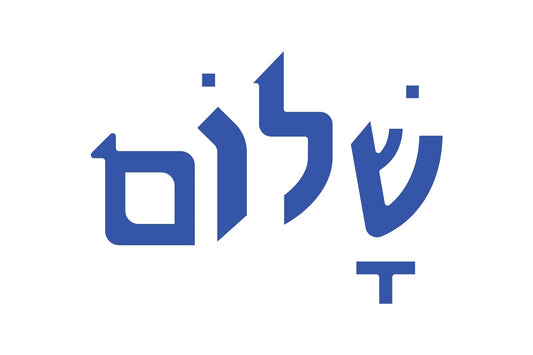
Knowing where the letters came from helps you see why they look the way they do—why ש needs a dot, why ץ drops below the line, why Torah letters have crowns, and why certain book faces feel “right” for long reading while others sing on a poster. The script isn’t just a tool; it’s a record of Jewish life moving across empires, technologies, and languages—landing, finally, in your hands.


